
RailGames is a set of interactive activities that riders of Seattle's Link Rail riders can engage in from their mobile devices, the results of which are displayed either on large displays in stations, or in the Link Rail tunnels themselves.
The City of Seattle extended the reach of the Seattle Link Rail in 2016, adding new stations to Capitol Hill and the University of Washington. The goal of this project was to understand how the Link Rail experience fits into the lives of its riders, and identify design opportunities that could improve the experience.
We completed this project for the upper-level undergraduate course HCDE 318: User Centered Design, part of the Human Centered Design & Engineering degree in the College of Engineering at the University of Washington, Seattle in Spring 2016.
I worked in a team of 3. We each conducted user interviews on the Link, built an affinity diagram, created personas, sketched scenarios, created sitemap, low & high prototypes, and wrote up annotated wireframes.
Design process: user research, affinity diagram, personas and scenarios, ideation, storyboard, site map, paper prototypes, user testing, high fidelity prototype, annotated prototype
We want to address the issue of Seattle Light Rail users becoming disoriented during their journey or having trouble navigating stations because of lack of knowledge of the station or area. We want to pinpoint users’ impressions while navigating the light rail stations at the UW, in Capitol Hill, by the stadium, International District and Airport.
We asked Link riders entering and exiting stations questions about why they were using the Link Rail, where they were coming from, and questions about experiences they had navigating the Rail in the past.
I collected interview data from users exiting the train at the University Street Station and Pioneer Square Station. My group members collected data at the University of Washington, Capitol Hill, International District, and Stadium stations.
Below are the data for the University Street and Pioneer Square stations.
University Street Station User 1
User 2
User 3
User 4
User 5
|
Pioneer Square Station User 1
User 2
User 3 (3 people)
User 4
User 5
User 6
User 7
User 8
|
Our team wrote observations from research on note cards, which we then laid out and grouped into themes that described user requirements. 6 major themes emerged.

6 Research Themes
|
The vast majority of users exiting at the Capitol Hill Station were familiar with the area, and many either lived or worked in Capitol Hill and commuted daily or multiple times a week. Others had a more limited knowledge of the light Rail, and were familiar only with their specific route. The ones who were less familiar with the area tended to be the users who had not used the light rail before, or who were travelling for social reasons such as meeting up with friends for lunch or looking for happy hour, or as tourists.
Information is important to users traveling on the rail. Different information is important to different users. These are some of the information users regarded as important:
How long will it be until the next train comes?
This is shown on overhead screen at stations, which gives wait times for trains going in either direction.
How full the next train would be?
Part of a user’s experience on the train depends on how crowded it is. This may influence a user’s choice to wait for a train or not, and could mentally prepare them for what to expect on the next train. This knowledge is not available at stations currently.
What time is the game?
Those travelling to the stadiums on game day may not all know specifically when their sporting event is, so being able to quickly check whether they are on schedule, early, or late would be relevant to them.
Weather Inquiry
Users would like to know what weather would be like at the destination they were travelling to. This might influence whether they pack away or use raincoats and umbrellas, and allow them to adjust activities or plans in response to weather changes.
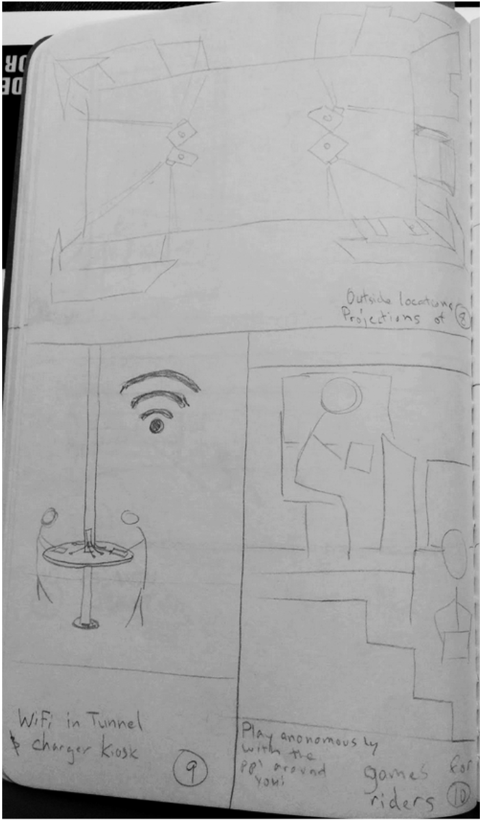
Link Rail riders tend to be on their phones while in the station and on the train. Similarly, multiple people have been observed with headphones in their ears. One couple mentioned that they wish there was better service on the Light Rail in the underground areas, because some stops are above ground while others are not. Electronics and devices seem to be part of (or at least influence) some riders’ experiences while riding the Light Rail.
Riders were curious about sports game times, train capacity, and departure/arrival flights from the SeaTac airport. These are fairly straightforward requirements, but some riders don’t have service underground and have difficulty finding answers.
Most riders had positive experiences regarding the simplicity and convenience of their trip. A new installation should not compromise the structures previously already in place that make it easy to use.
Many users were unsure about when they would reach their destination, or when to get off. We have an affordance to assist people in deciding with what to do next on their trip. This theme may rely on other themes that were identified e.g. Info Wanted and Knowledge of Area.
The personas we created are fictional characters whose aspects and qualities stem from the research we did when observing and talking to people around the light rail.
With our research findings, we conducted an affinity diagram to organize our raw data into more cohesive themes. With these themes, we were able to base our persona’s goals and traits on generalized users from our research. Some goals and traits of the persona were taken directly from the interviews we conducted.
With our personas in mind, our design objectives can target the large range of people we observed and interviewed while still being directed towards the details of a single, fleshed out “user”. Creating personas influenced our work by providing a more human representation of the research data we had collected.


We came together as a group and sketched the top ideas from our individual sketches, or combining concepts from multiple ideas.


We came up with a list of 3 possible design directions:
See full descriptions of ideas
There were several areas where usability of the station could be improved, but overall, the Link Rail seemed logistically easy to use. We decided to combine several of the above concepts into one idea. From field interviews with Link Rail users, we found that the majority of users of the Link Light Rail use their time on the Link either to relax and look out the window, or to play games on their phones.
We decided to develop an interactive collection of activities users can engage in on their phones, the results of which are displayed either on large displays in stations, or in the Link Rail tunnels themselves. This is meant to give users something to do on their commute, and feel like they are customizing their Link Rail experience and interacting with other passengers.
The application also keeps track of progress toward the destination, and notify them when they are close.
After we sketched design ideas to meet the needs of the personas, we individually generated a storyboard for each of our top three sketches. These storyboards explore a contextual interactive experience of our users. Our main purpose for this stage in the process is to refocus the application's flow and design on the user-centeredness. Below is a brief description of my storyboards.
As people commute, the tunnel walls are dark and repetitive, so the idea behind our moving narrative is to utilize that space for various games: namely trivia and coloring. We are considering including a quotes or thoughts of the day submitted by users. The game would be projected on the walls of the tunnel as well as the walls of the station. Riders who do not want to play can watch the game out the windows while those who want to play will do so via an app on their smartphone. The ability to play as a team is also on the table. Maybe the results from people in one train are paired against the people’s results from another train?
The app will open to a screen with game options:
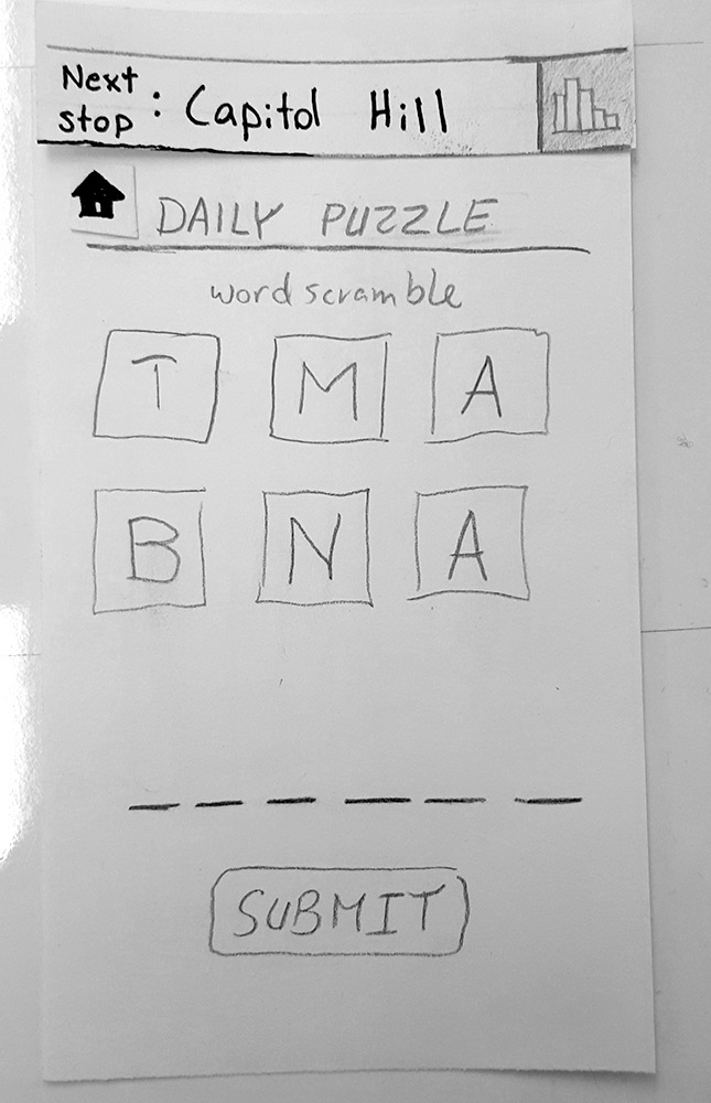
Trivia: Create a username and click go. The next question gets loaded on the phone. The user selects the answer from multiple choice within a limited timeframe indicated by a line timer. Once all answers from users comes in, it shows the correct answer and how many people got it correct.
Coloring: This game opens up a color wheel to choose a color or shape. Then the user draws on their phone and it translates to the projected area and mixes with other users canvas.
Quotes / Thoughts: The user would type in or search for preselected quotes to submit on the projected area. This would allow users to feel connected with fellow riders.


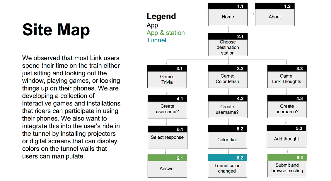
After the creation of our contextual storyboards we developed a the sitemap for our application. Which reflects the most user-centered flow.
We created the sitemap to help organize the various screen ideas we had thought up for our phone application design. When creating the sitemap, it was important to take into consideration the information that the users see as each screen progresses. As we planned an organized our sitemap, we discussed which screens were more important in the hierarchy of information for the user and we adjusted the amount of steps taken to get to each screen accordingly.
The sitemap relates to our paper prototypes because it acted as a template for our prototype to expand from. Many of our first sketches for our paper prototype came from the sitemap. Since the sitemap labeled general headings of what should be on each page, our paper prototypes went more in depth on the visuals and connections between each screen.
Initial Sketch Prototype Mockup
Link to full interactive sketch prototype
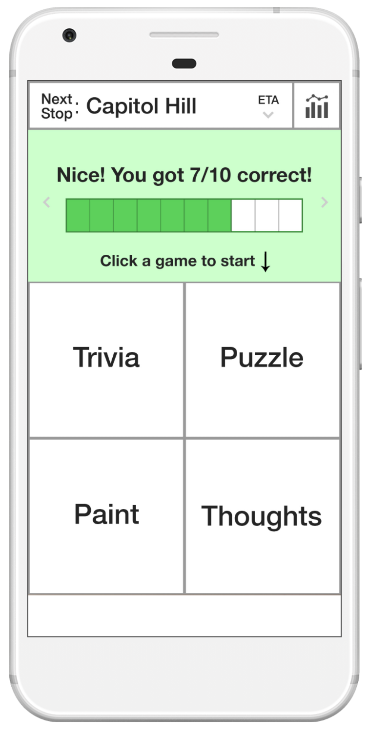
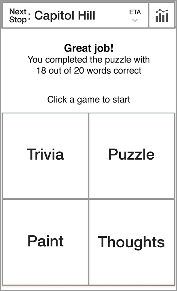
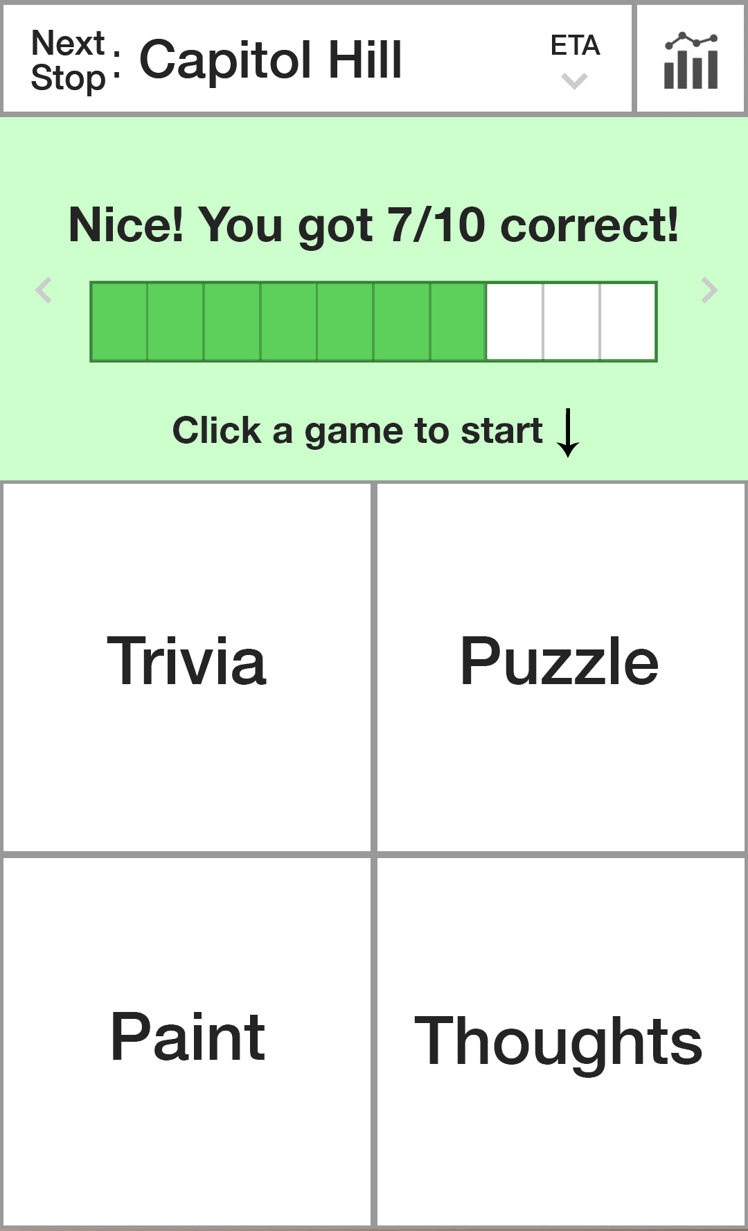
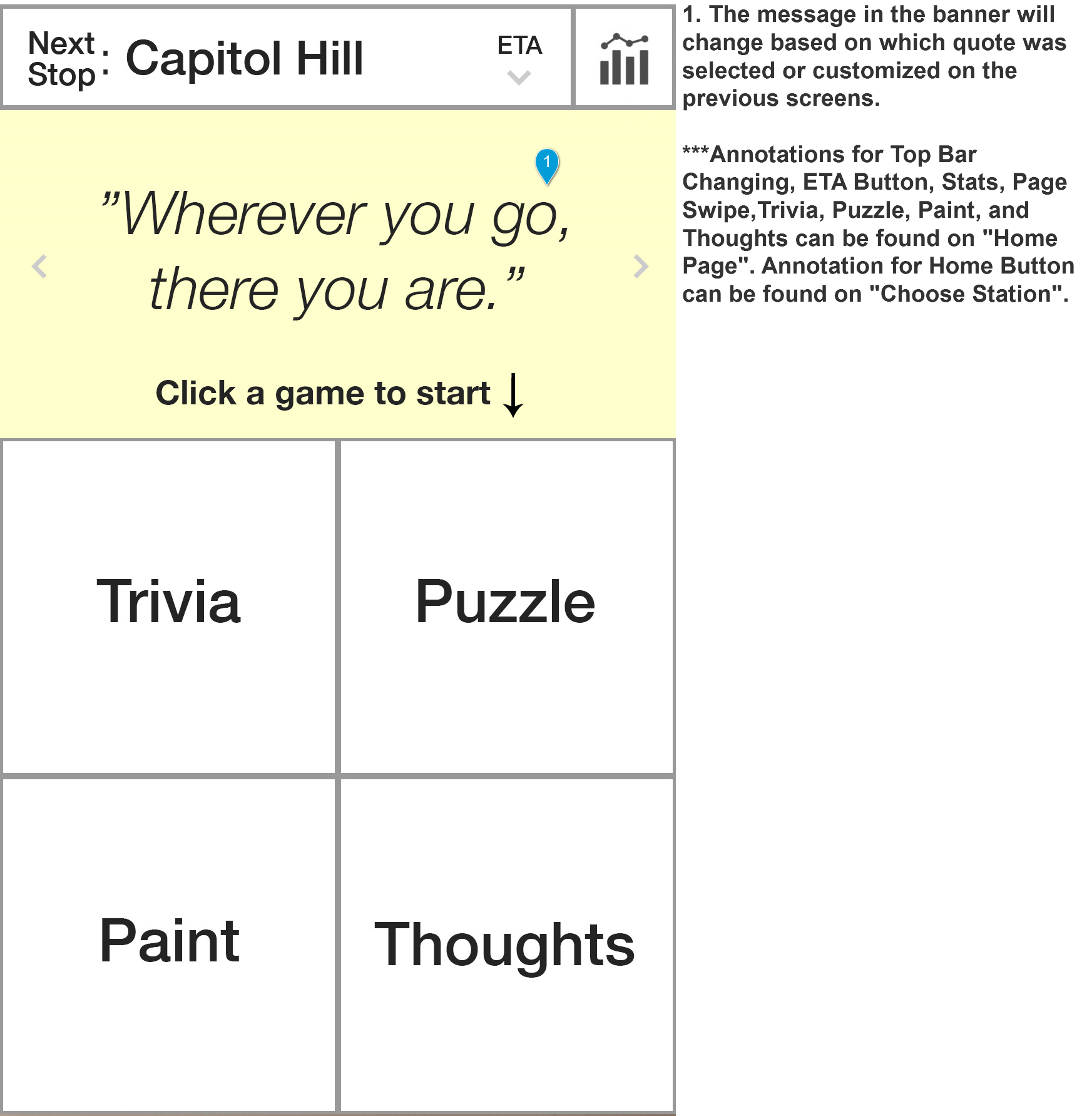
Our application consisted of 4 "activities": Trivia, Puzzle, Paint, and Thoughts. Users can play these games during their ride, and check results on games that they have played. They can also keep track of how close they are to their destination. The "installments" would be located in the stations themselves, and display Trivia data as well as thoughts that have been shared using the app, which can help encourage riders to play and give riders using the app a sense of community. Data from the "Paint" game would be aggregated in real time to create a dynamic moving visual that users could see projected onto the tunnel walls as the train moves.


After making our constructing our first paper prototype, we were interested in how users would interact with it. Was the application self-explanatory? Did it seem like something the user would use? We conducted usability testing by instructing 6 users to interact with the application. Some tests were conducted on the Link and some were not. We asked users to comment on any thoughts they had or challenges they came up while trying to use the product, and recorded these, and made changes based on user feedback before testing the prototype on the next participant.
This document lays out the observations from each round of usability tests, followed by a list of actionable changes we made or intended to make to the application in the wire-framing phase. Our last prototype was digital. This made it easier to generate wireframes in the next phase of design.
This was an essential part of our design process. Although we our prototype was based on what we thought would give the user an interactive experience, it was essential to ensure that the implementation of our ideas actually had the desired effect. There were problems with confusion and holes in functionality we never would have been able to address without this perspective. Creating multiple iterations throughout the process also allowed us to verify that changes we made to address a specific issue didn’t interfere with other functionality.
Readability: Our early versions were done on paper then photographed and scanned and put into the POP application to test participants on a phone. Some of the feedback we are getting is that the hand drawn pencil/pen on paper is adding a barrier for understandability. We then moved our design into simplified digital mockups to help with the readability. We received better feedback after our move to the digital versions. The comments were more focused on the interactions we were testing.
Affordances
Color Chooser: Our hand-drawn paper prototypes did not properly translate a few affordances we were wanting to create for our participants. Our color chooser was to offer the full gradient of colors to the user as options but our paper prototype looked like three color choices.
Clock Timer: Both paper and digital prototypes did not translate our need for a timer as we were not able to show any temporal animations via static screens.
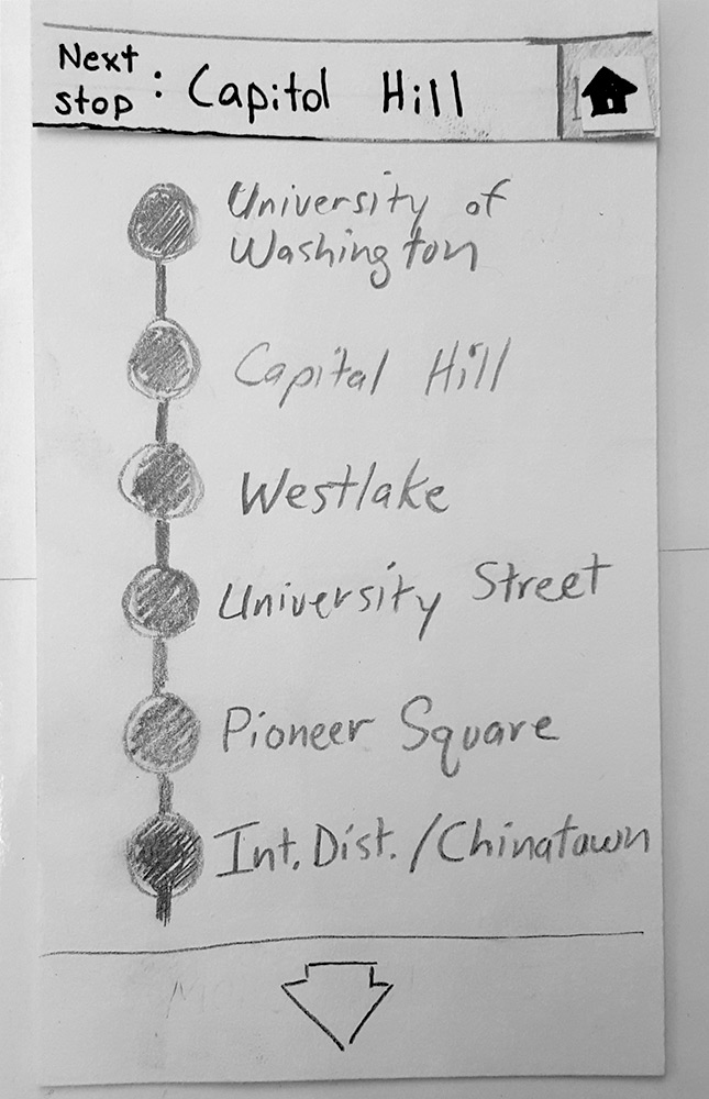
Set Destination: Both paper and digital prototypes were not able to display the Set Destination Bar at the top of the app properly. Once the destination is selected, this bar is supposed to show an ETA countdown as well as a progress bar that moves from left to right indicating how far you have left to go on your trip.
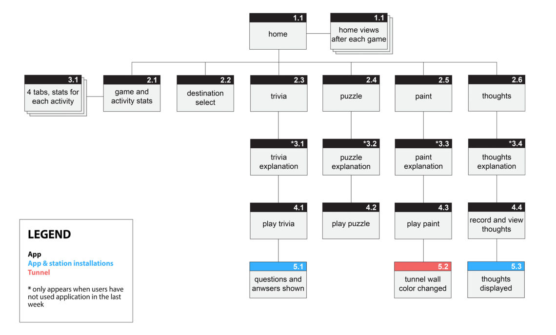
Once user testing was completed and findings were evaluated, I used the leverage of the findings to update the prototypes to full system wireframe. Below are the wireframes I created using a combination of Illustrator and Axure.


We each did another round of user testing with the Digital Wireframe Prototype and I designed a High Fidelity Digital Prototype using Illustrator and the prototype application POP. You can see the interactive digital prototype here.


Here are the additional changes made to the High Fidelity Prototype:
|
|
I added annotations next to each screen to add concision and clarity to each component in the wireframe. The annotations include rationale written by the team for our design decisions. They are to help situate the client, developer, or other team members when necessary.
Below is the Annotated Wireframe.


This concludes our work on this project, but future steps would include creating high fidelity mock ups of our wireframes, conducting another iteration of user testing and design adjustments on the high fidelity prototype, and then move into the development stage.